Showcasing Affiliate Marketing Services

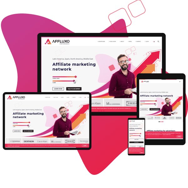
This project was for an affiliate marketing company looking to showcase their services in an easier way through their responsive website. Our approach was to create a user-friendly and visually appealing design that would facilitate the company’s marketing strategy. We have created a responsive website that offers an immersive experience on any device.
Showcasing More Services on Website

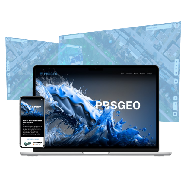
The website needed to be redesign to highlight company’s offerings beyond cemetery services, showcasing their innovative technologies and unique solutions for businesses across various industries. The user experience of the website is intuitive and streamlined, with clear navigation and easily digestible content that serves to inform and educate users about the company’s products and services.
Optimizing delivery tasks

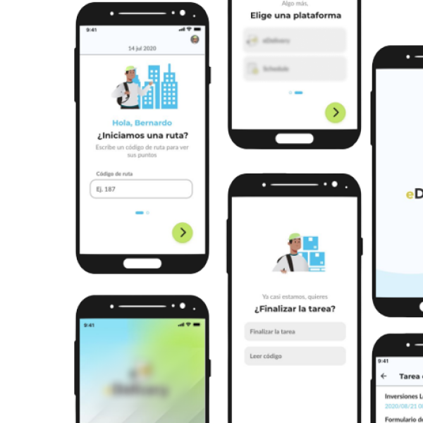
The redesigned delivery mobile app prioritizes ease of use, speed, and customization. Key features like real-time tracking, personalized notifications, and user-friendly navigation help streamline the delivery experience for carriers. One of the biggest challenges was creating a design that accommodated a wide range of delivery types, including food, groceries, retail items and also services. To address this, we implemented a customizable dashboard that allows users to select their preferred delivery options and tailor the app to their specific needs.
Fleet overview for managers

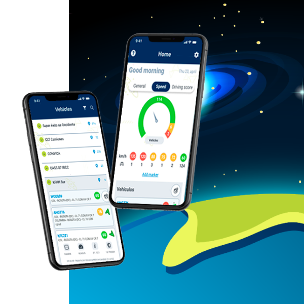
The first approach for this logistic GPS-based platform was to improve the interface’s aesthetic, but after conducting research and evaluating the existing user experience, it became clear that a comprehensive redesign was necessary, we was in front of the tip of the iceberg. The redesigned app and platform now offer a more user-friendly experience, providing enhanced operational insights to help streamline fleet management. The client was thrilled with the final product and noted significant increases in productivity and efficiency since the launch of the new platform. Upgrading user experience on a logistic mobile app Project The product is part of a logistic management web platform that allow users to track their actives, fleets and employees using GPS/GPRS technology. This product includes around of 54 different modules and features, also hundreds of active devices reporting data all the time. Before the project, it was a hybrid app launched in 2005 to provide users real time data from their mobile phones and facilitate the fleet manager’s decision-making. When changing is a necessity We tried to resolve the user experience struggles within the app, such as usability issues, visual and brand inconsistencies in the user interface, and some weaknesses in the actions that users needed to do. At the same time, we thought of other tech alternatives to develop the app because maintenance of the hybrid version was becoming untenable. We knew users were resistant to change, but at the same time the product needed to highlight their benefits, to show it’s a vanguard technological product and to be outstanding in the market Project framework Process: Empathize User research After we got the bit picture with stakeholders and some of desktop research analyzing competitors, we were ready to deepen in users world through observation, interviews and surveys, because we wanted to determine how our users manage their operation. Some pain points are listed below. Look and feel Features Usability Reliability Process: Define Defining the problem It’s time to collate data from the previous stage to define the design problems and challenges. Our problem statement: Juan is a busy fleet manager who needs a faster, more reliable and usable tool to view and manage their fleet events, because he needs to stay on top about those and able to make informed decisions on the go. Process: Ideate The fun part At this moment, I need to make the process organized to translate ideas in better form. The visuals & features of ideation tools bring clarity to the bumbled-up ideas. Prioritize We needed to prioritize, and we used the Moscow method, a prioritization technique used to reach a common understanding with stakeholders on the importance they place on the delivery of each requirement. Mind mapping After data analysis, it is helpful to put the ideas on paper to make connections in a visual form and notice new things that I didn’t see before. Branding Also, I learned about the brand, origin, meaning, spirit and values to help to build a consistent product across the mediums. As a result, it was necessary to suggest some changes to help the brand communicate better and adapt it better to the different mediums. I didn’t want to change the logo, only adjust it to the current needs. Basically, I changed the color palette a little to make it more brilliant, I rearranged symbol’s elements to improve readability in small formats, I polished the endings and symmetry and kept the typography. Sketching For the home screen, we thought about immediacy and different ways to show relevant data to know what’s going on. Clear buttons to go to details about vehicles. Another critical part in the operation is the visualization of the status and location of the vehicles in real time, this can be as complex as needed and that is why the use of symbols and expandable menus is suggested to see the details. Also, we considered main indicators about the operation to put them in the home screen. We proposed three tabs with summary information. Process: Prototype The new app I created wireframes, a simple and clear representation of the product that help users to have an idea about the final product, sections, buttons, main features, so in this way we can test the product before invest more time on it. Process: Test The moment of truth Usability study summary and findings, early test. Study type: unmoderatedLocation: Colombia, remoteParticipants: 10Length: 20-30 min. Some findings Tabs are not clear enough. 7 of 10 users couldn’t understand the tab’s navigation bar. Maps options are hidden. Most of the users couldn’t find options like ‘send command’ because they weren’t obvious. Vehicle detail is confusing. “Fleet and vehicle look similar, I couldn’t see the difference”. Process: Prototype Refining the design It’s time to refine the design, adding more details to getting closer to the real product, besides, I added interaction to test with users again. This is the core product of the company, was established a system of transversal design to the devices to be able to visually and functionally guide the other products and no longer look disconnected from each other. Finally, it’s time to refine the design, I added details, and apply the defined design system to build a more real version of the final product. Time to innovate, thanks to the insights of the research, we included sections of interest, such as the top 5, filters and we were able to improve the way to represent and find others like speed markers and paths. Impact Here is a quote from one of the Company’s consultants: “I’m sure that this new app will put us a step ahead of the competition, because it is simple, beautiful and cover all the user needs” Challenges Uno de los retos de este proyecto fue el tratar de equilibrar los cambios, ya que mientras unos usuarios requerían mejoras en los flujos de tareas otros estaban muy acostumbrados al modo de funcionar de esta app con más de 10 años en sus dispositivos prácticamente sin cambios. Algunos de los cambios
Sales Supporting Web App

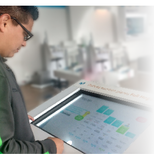
We leveraged some 32” touch screens along the company’s stores to gain users interactions and engagement. We design useful experiences that support sales process. Problem Sales consultants frequently receive the same case’s type (80%). Meanwhile, clients wait for assistance for a long time. Opportunities Young people visit service points, open to self service and new experiences with products and services.114 32” Touch screens ELO ET3201L avalilable at service points around the country. Goal Design useful experiences, that support sales process at services points. Team User research, User experience design, User Interface design and front end developer: Yoanna Centeno.User research, User experience design and User Interface design: Minerva Lorenzo. Research How we did it?– Observation at service points.– Contextual interviews.– Surveys. We found that users… – Can visit service points to know the news (60%), do payments (90%) and replace simcards (30%).– They like to try out the exhibition smartphones and devices, because they want to know trends, and they feel curiosity about it, but many of them (85%) also didn’t know if they can interact with it.– Want a personal experience when they visit the service points.And sales consultants– More than a half didn’t use touch screens to support sales process.– Almost all of them don’t know how to use touch screens. Based on research, we identified three key people involved in the experience Sales consultant Andrés Andrés is a proactive sales consultant who needs up to date sales tools, because he wants to offer better experiences to his customers. Customer Natalia Natalia is a tech student and worker who needs interactive tools to experience new products and services at service points, because they wasn’t to wait for personal assistance. Customer B2B Carla Carla is a shopping analyst who needs intuitive navigation tool with complete information because they want to know the offer of services and corporate solutions quickly. The solution Design and developing Design– Paper sketching and wireframing.– Adobe Photoshop and Adobe XD for prototyping.– Testing XD prototypes with users.– We iterated on designs to fit them to users needs. Frontend developing– HTML 5.– Bootstrap 4.– CSS3.– JavaScript. After launch, we observed the Google Analytics data to continue improving the solution. We try to inspire the experience of the solution on mobile phones, taking advantage of the screens design. – Animated hamburguer menu.– Also, we made a responsive solution, because screens already was at service points around the country, some in portrait mode and others landscape mode.– We made the solution responsive using web technology as Bootstrap 4 and CSS 3. Challenge: Data may vary according to the area of the country or time. We insert variables in the web layout from an existing module, to a remote administrator could change data without affecting the design. We used scripts to segment content according to the area, with other technologies as JavaScript, PostgreSQL and JSon. Challenge: We find basic and savvy users, referring to technical knowledge about mobile phones. – We made a main section about mobile phones, because on 65% of their visits, users are looking for what’s new about mobile phones and devices. – Users can explore by brand,– And see basic characteristics like screen size and storage, but savvy users also can see technical details, enough to make a comparison or buy Testing and iteration – We thought that implementing interactive software on screens might not be obvious to users and sales consultants.– In fact that it was. Based on data from Google Analytics, we were able to see low interaction in the first implementation phase.– The best solution in that moment was to suggest interaction to users through reels and animated buttons, so the interaction increased by 35%. What’s next A digital product never be complete or finished, because users needs, technology or even business needs may change, so it’s necessary– On this solution we could to know valuable interaction data, as the most visited pages, time on sessions, quantity of interactions, and more, so we can continue observing data from Google Analytics to analize the users behavior and keep adjusting the solution.– Include search buttons for products and services.– Conduct studies to consider new functionalities integration as payments, user account access or purchase buttons for plans and services.