Scaling sales through self-service: A 35% increase in user engagement
Creation of an interactive digital catalog and self-service touchpoint deployed on 32″ industrial touchscreens (Model ET3201L) at national service centers in Colombia. This digital product bridged the gap between the physical store experience and digital depth, allowing users to explore mobile plans and smartphone catalogs autonomously. The problem Operational friction in high-traffic service centers, the bottleneck is human […]
From technical debt to operational efficiency: redesigning the Space ecosystem

Challenge: The “black hole” effect in legacy systems In the logistics sector, reliability is the primary currency. I took on Space, a GPS monitoring solution launched in 2012 as a hybrid web app. After a decade, the product suffered from what I call the “black hole effect”: an obsolete interface, sluggish response times, and a critical […]
One Brand, One System: Unifying a Diverse Product Portfolio
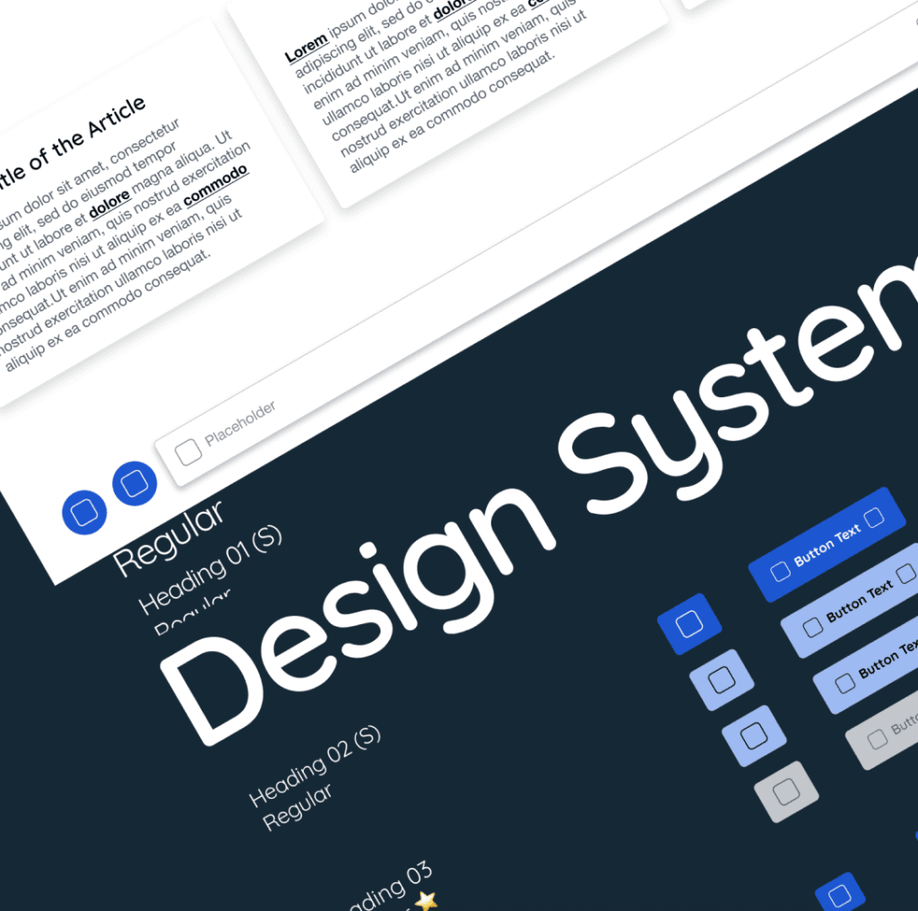
Challenge Company’s expanding product ecosystem, which includes NEMT apps, PDM software, and new solutions, is facing scalability and consistency issues. The growth of our remote dev and design teams has led to a fragmented user experience, where products lack a unified visual identity and brand consistency. This also creates development inefficiencies, delaying updates and the […]
Optimizing delivery tasks
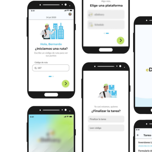
The redesigned delivery mobile app prioritizes ease of use, speed, and customization. Key features like real-time tracking, personalized notifications, and user-friendly navigation help streamline the delivery experience for carriers. One of the biggest challenges was creating a design that accommodated a wide range of delivery types, including food, groceries, retail items and also services. To […]
Fleet overview for managers
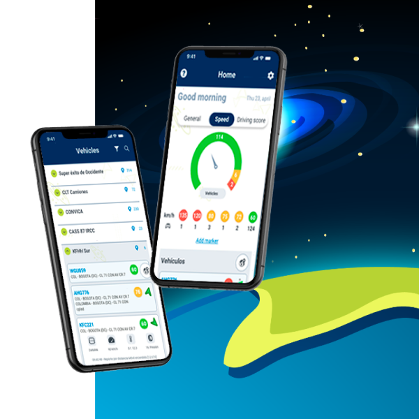
The first approach for this logistic GPS-based platform was to improve the interface’s aesthetic, but after conducting research and evaluating the existing user experience, it became clear that a comprehensive redesign was necessary, we was in front of the tip of the iceberg. The redesigned app and platform now offer a more user-friendly experience, providing enhanced operational […]
Community Missions App
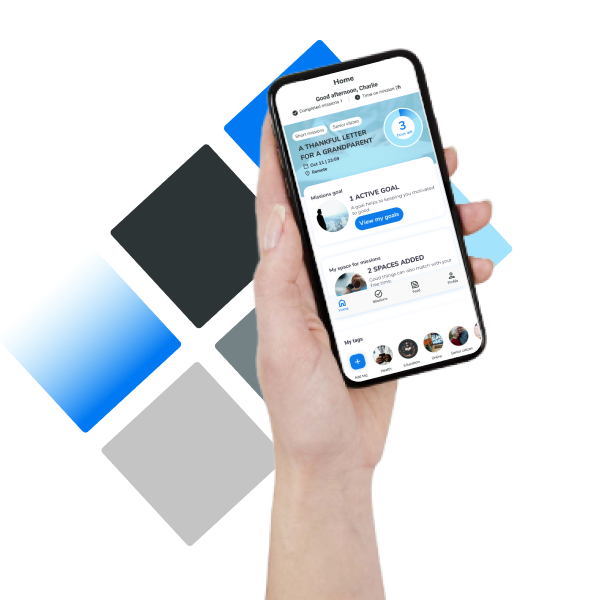
I had the opportunity to listen to busy people’s reasons for not helping in their communities and I shaped a solution for that. Missions4Life aimed to help millennial users get involved in community services in their local areas. The app is designed to manage small missions, making it easy for users to join and help out […]
1:1 Mentoring Solution for designers
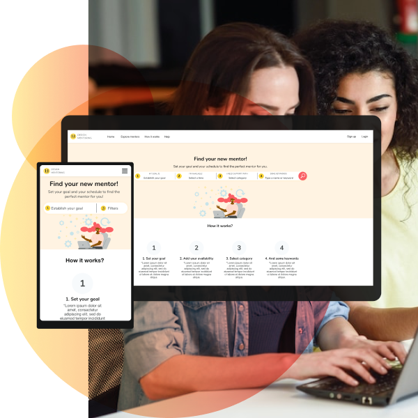
My cross-channel mentoring platform is designed to help junior or stuck designers reach their professional goals by connecting them with experienced designers. The platform offers a range of features, including one-on-one mentorship, group mentoring, job shadowing, and peer review. I have optimized the platform for desktop and mobile devices, ensuring that designers can access the […]
Sales Supporting Web App
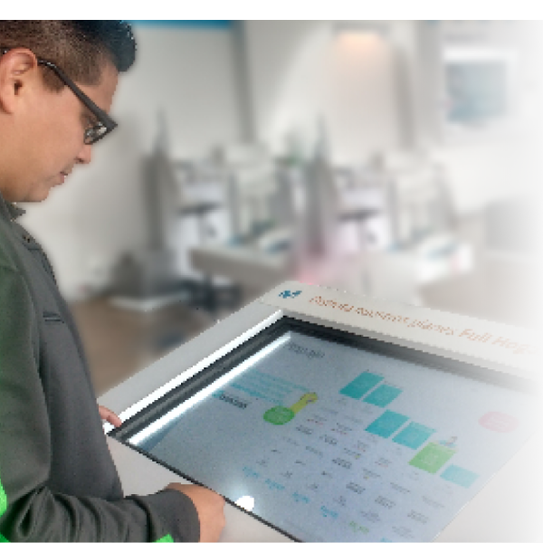
We leveraged some 32” touch screens along the company’s stores to gain users interactions and engagement. We design useful experiences that support sales process. Problem Sales consultants frequently receive the same case’s type (80%). Meanwhile, clients wait for assistance for a long time. Opportunities Young people visit service points, open to self service and new […]