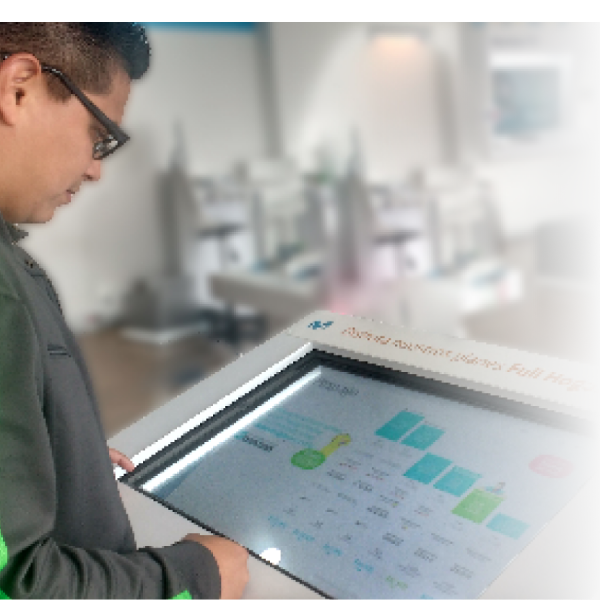
Life-saving app for contact with dangerous species in nature

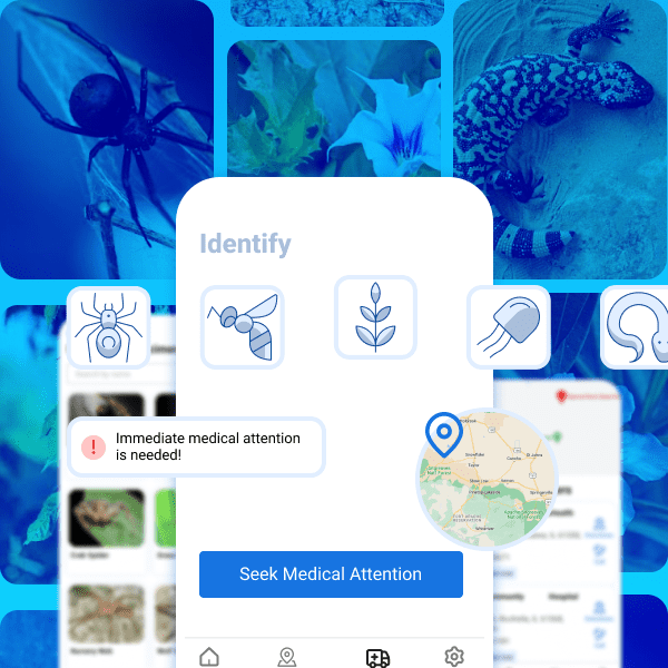
This project is a life-saving emergency mobile app designed for individuals who are at risk of being bitten by a venomous snake or encountering other dangerous animals or plants in nature. The app incorporates cutting-edge technology and a user-friendly interface to provide detailed information on different species of dangerous animals and plants. The app features an easy-to-navigate UI, clear instructions, and an intuitive design that allows users to easily report incidents, locate the nearest emergency center, and receive guidance when needed. It also includes a database of venomous specimens to assist users in identifying the creature responsible for their bite or contact. Design decisions Additionally, the app features a detailed tutorial section, where users can learn more about snake bites, the symptoms to look out for, and the immediate measures they can take while waiting for medical help to arrive. Audience All audience, Non tech-savvy users, iOS, Android, Emergency situations. Challenge Walkthrough app for emergency use. Deliverables Figma interactive prototype to get funding, Figma design file and specs for development.
Secret Chat App

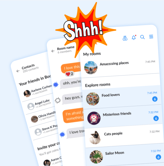
An overview for this Chat app, Contacts, Rooms and Chat Screens. Goal was make it look similar to some iOS apps that are familiar to users
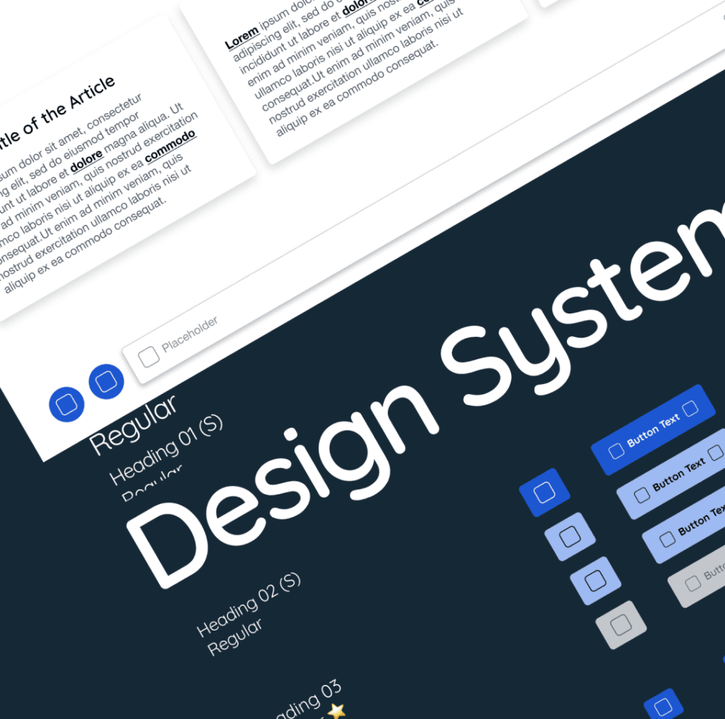
Simplicity as Key Value for this Money Transfer App

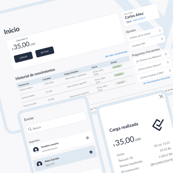
For this money transfer app project our goal was to create a user interface that would be simple and clean, yet could be easily scalable in the future. To achieve this, I focused on developing a design system that incorporated minimalistic, intuitive elements that could be easily expanded upon without sacrificing simplicity. First, I ensured that the app’s core functionality and essential components were clearly visible and accessible, using a hierarchy of intuitive menus and buttons. This would allow users to perform transactions quickly and easily, while minimizing the risk of any errors. Next, I carefully chose a color palette and typography that emphasized clarity and consistency, making it easy to identify different parts of the app at a glance. This would also facilitate future design expansion, as new features could be easily incorporated while remaining true to the app’s core visual messaging. Overall, by prioritizing simplicity and future scalability in the design process, I believe we have created a highly functional and user-friendly money transfer app that will be appreciated by both current and future users.
Showcasing Affiliate Marketing Services

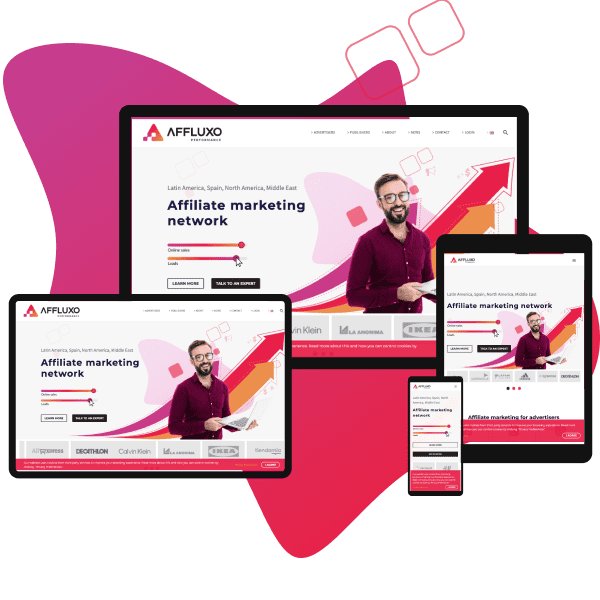
This project was for an affiliate marketing company looking to showcase their services in an easier way through their responsive website. Our approach was to create a user-friendly and visually appealing design that would facilitate the company’s marketing strategy. We have created a responsive website that offers an immersive experience on any device.
Showcasing More Services on Website

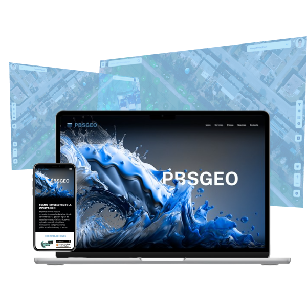
The website needed to be redesign to highlight company’s offerings beyond cemetery services, showcasing their innovative technologies and unique solutions for businesses across various industries. The user experience of the website is intuitive and streamlined, with clear navigation and easily digestible content that serves to inform and educate users about the company’s products and services.
Restaurant & Bar Website Design

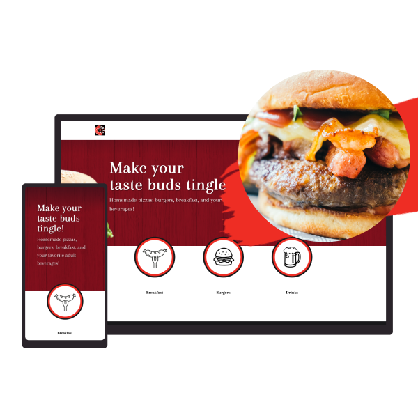
As a strategic web designer, I have designed a responsive website for a restaurant to help showcase its menu, location, and services. The website has a modern and clean design that allows users to easily navigate through the pages on both desktop and mobile devices.Overall, the responsive website has been designed with the aim of providing a seamless user experience while showcasing the restaurant’s unique offerings.
1:1 Mentoring Solution for designers

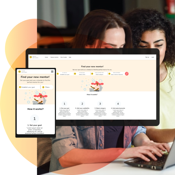
My cross-channel mentoring platform is designed to help junior or stuck designers reach their professional goals by connecting them with experienced designers. The platform offers a range of features, including one-on-one mentorship, group mentoring, job shadowing, and peer review. I have optimized the platform for desktop and mobile devices, ensuring that designers can access the mentoring tools they need regardless of their location. Product The 1:1 Design Mentoring is a platform that connect design people, mainly design students with qualified mentors. Problem Target users of this platform are designers and design students who want to be connected with qualified mentors that support them through their professional career. Goal The goal is to design a responsive website with a request mentoring flow that is easy, friendly and accessible. My role I was the user experience designer for this project.What does this mean? I was responsible for both concept and visual design, through a structured process in different stages and playing different roles for each one of them: user researcher, interaction designer, data analyst, visual designer. Methods & tools I used the Design Thinking framework to carry out all the activities needed to structure this project, from the problem to a design solution. Through the Empathize, Define, Ideate, Prototype and Test phases, I could use some tools and methods to helped me to achieve the goal: Competitive audit, Persona, Interviews, User journey map, Empathy map, Wireframing, Sketching, Sketching, Mockups, Usability study, Prototypes. User research summary I conducted interviews and created empathy maps to understand the users I’m designing for and their needs. A primary user groups identified was final year design students who want to be prepared for the labor field, the other group was professionals who want to improve their specific design skills. Main user’s pain points A bunch of information To have to analyze a bunch of information about different mentors and doesn’t know who is the best fit mentor to them. To have to send a blind request Users can’t figure it out mentors availability. So they must send some mentoring request and to wait for responses. Need guidance Users know they need a mentor, but they don’t necessarily know the path they need to follow to accomplish their goals. User research summary We design personas based on research, to help us to understand user’s needs, experiences, behaviours and goals. User journey map Scenario: Thomas is trying to find available mentors to send request and get response quickly. Starting the design Sitemap Time to start to shape the solution, information architecture helped me to draw the path of users on the platform to reach their goal on this platform. Sketching Put ideas on paper is key to quickly materialize ideas and analyze the flow. Homepage ideas I sketched out ideas, keeping the user’s pain points about navigation and browsing in mind. These home screen paper wireframe variations help to keep the focus on optimizing the browsing experience. I kept the best ideas of each one: assistant or step by step search And, simple search bar focused and designed on user goal. Screen size variations My priorities were to keep the focus on the criteria to search a mentor, and help users to know how to start. Mobile wireframe– Home page– Hamburger menu– One screen to set the filters Desktop wireframeHome page with big search bar above the fold Time to digitalize ideas and to test them Digital wireframes I tried to keep the page clean, focusing the attention on the search bar. Search bar with four basic fields to help to define the user needs. I thought to establish date and time ranges would be easy to select and to match with more available mentors. Low fidelity prototype This lo-fi prototype simulates searching mentor flow, to get system suggestions based on users preferences and send the mentoring request. Usability study Study type Unmoderated usability study Location United States, Remote Participants 10 participants Length 20-30 minutes The low fidelity prototype was tested with 10 users, at this level, we can uncover the most common issues and learn how our designs perform with sufficient participants for accurate results. The findings are listed below: 1. Search bar7 of 10 users prefer search bar over navigation. 2. Users lost2 of 10 users felt lost in the task to find a mentor.“Wasn’t aware how to approach it in the first place” 3. Calendar3 of 10 users felt out of control with the 3 hours interval range on the calendar. 4. First clicksMost users prefer to click the first search field, to the left side of the search bar. Refining the design Thanks to usability study findings, I could notice some unclear elements on the design. So it was necessary to take some decisions 1. Include better cues to users to know what to do on the website. Numbers from 1 to 4 to follow a path. 2. Modify the search button to make it more visible and related with the search bar. 3. On the search bar date selector, I included a calendar to select a specific date and time to find a mentor, instead of a range of dates. 4. Prioritize the items in the search bar, to help users follow a logic path. Why? Users tryed to find something first on the left side of the search bar. See heat map, that shows users interactions (clicks) on the home screen. Desktop screen size mockups Mobile screen size mockups See in action the web site See in action the mobile version Takeaways Impact Our target users shared that the design is intuitive to navigate through, demonstrated a clear visual hierarchy and flow, they also felt comfortable with the ‘clean and modern design’. What I learnedI had to heed while users tested the flow, that’s why I could learn more about users preferences and first impressions with the product, to make it more acquaintance with their expectations. Next steps– Conduct follow-up usability testing on the website. – Continue with design of additional flows on
Sales Supporting Web App

We leveraged some 32” touch screens along the company’s stores to gain users interactions and engagement. We design useful experiences that support sales process. Problem Sales consultants frequently receive the same case’s type (80%). Meanwhile, clients wait for assistance for a long time. Opportunities Young people visit service points, open to self service and new experiences with products and services.114 32” Touch screens ELO ET3201L avalilable at service points around the country. Goal Design useful experiences, that support sales process at services points. Team User research, User experience design, User Interface design and front end developer: Yoanna Centeno.User research, User experience design and User Interface design: Minerva Lorenzo. Research How we did it?– Observation at service points.– Contextual interviews.– Surveys. We found that users… – Can visit service points to know the news (60%), do payments (90%) and replace simcards (30%).– They like to try out the exhibition smartphones and devices, because they want to know trends, and they feel curiosity about it, but many of them (85%) also didn’t know if they can interact with it.– Want a personal experience when they visit the service points.And sales consultants– More than a half didn’t use touch screens to support sales process.– Almost all of them don’t know how to use touch screens. Based on research, we identified three key people involved in the experience Sales consultant Andrés Andrés is a proactive sales consultant who needs up to date sales tools, because he wants to offer better experiences to his customers. Customer Natalia Natalia is a tech student and worker who needs interactive tools to experience new products and services at service points, because they wasn’t to wait for personal assistance. Customer B2B Carla Carla is a shopping analyst who needs intuitive navigation tool with complete information because they want to know the offer of services and corporate solutions quickly. The solution Design and developing Design– Paper sketching and wireframing.– Adobe Photoshop and Adobe XD for prototyping.– Testing XD prototypes with users.– We iterated on designs to fit them to users needs. Frontend developing– HTML 5.– Bootstrap 4.– CSS3.– JavaScript. After launch, we observed the Google Analytics data to continue improving the solution. We try to inspire the experience of the solution on mobile phones, taking advantage of the screens design. – Animated hamburguer menu.– Also, we made a responsive solution, because screens already was at service points around the country, some in portrait mode and others landscape mode.– We made the solution responsive using web technology as Bootstrap 4 and CSS 3. Challenge: Data may vary according to the area of the country or time. We insert variables in the web layout from an existing module, to a remote administrator could change data without affecting the design. We used scripts to segment content according to the area, with other technologies as JavaScript, PostgreSQL and JSon. Challenge: We find basic and savvy users, referring to technical knowledge about mobile phones. – We made a main section about mobile phones, because on 65% of their visits, users are looking for what’s new about mobile phones and devices. – Users can explore by brand,– And see basic characteristics like screen size and storage, but savvy users also can see technical details, enough to make a comparison or buy Testing and iteration – We thought that implementing interactive software on screens might not be obvious to users and sales consultants.– In fact that it was. Based on data from Google Analytics, we were able to see low interaction in the first implementation phase.– The best solution in that moment was to suggest interaction to users through reels and animated buttons, so the interaction increased by 35%. What’s next A digital product never be complete or finished, because users needs, technology or even business needs may change, so it’s necessary– On this solution we could to know valuable interaction data, as the most visited pages, time on sessions, quantity of interactions, and more, so we can continue observing data from Google Analytics to analize the users behavior and keep adjusting the solution.– Include search buttons for products and services.– Conduct studies to consider new functionalities integration as payments, user account access or purchase buttons for plans and services.