From technical debt to operational efficiency: redesigning the Space ecosystem

Challenge: The “black hole” effect in legacy systems In the logistics sector, reliability is the primary currency. I took on Space, a GPS monitoring solution launched in 2012 as a hybrid web app. After a decade, the product suffered from what I call the “black hole effect”: an obsolete interface, sluggish response times, and a critical […]
Simplifying Dining Payments
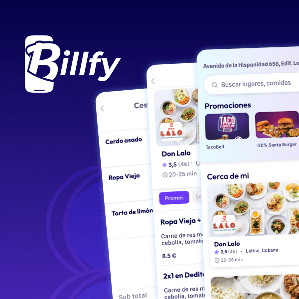
Billfy: Streamlining Restaurant Payments Through Design Billfy is a mobile application designed to facilitate seamless payment experiences for restaurant-goers. As a UI designer, my role was pivotal in conceptualizing the brand, crafting the logo, and prototyping the app’s main flow. Challenges: The primary challenge was to eliminate the friction points commonly associated with restaurant payments, thereby […]
Life-saving app for contact with dangerous species in nature
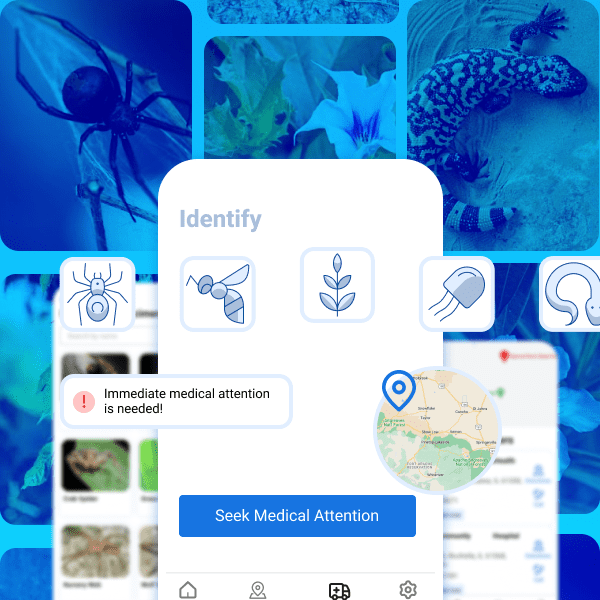
This project is a life-saving emergency mobile app designed for individuals who are at risk of being bitten by a venomous snake or encountering other dangerous animals or plants in nature. The app incorporates cutting-edge technology and a user-friendly interface to provide detailed information on different species of dangerous animals and plants. The app features […]
Secret Chat App
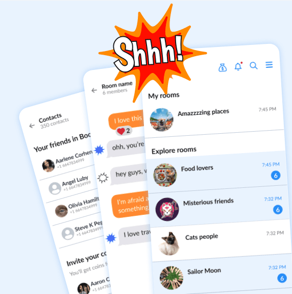
An overview for this Chat app, Contacts, Rooms and Chat Screens. Goal was make it look similar to some iOS apps that are familiar to users
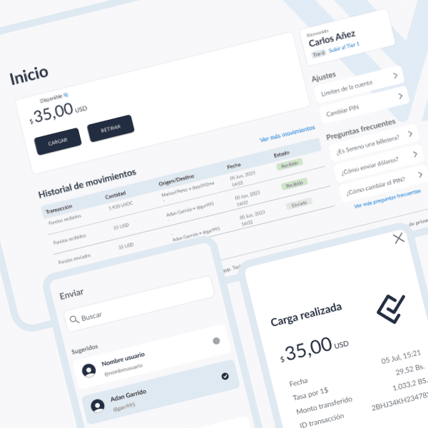
Visual Concept for a Money Remittance Platform
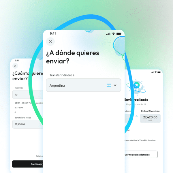
The project involves a money transfer app that was designed to target mainly senior people. The primary goal for this app and website was to keep the interface simple and intuitive, looking clean and modern. We could achieved this by keeping the user interface clean and ensuring the key functions like transferring money and managing […]
Simplicity as Key Value for this Money Transfer App
For this money transfer app project our goal was to create a user interface that would be simple and clean, yet could be easily scalable in the future. To achieve this, I focused on developing a design system that incorporated minimalistic, intuitive elements that could be easily expanded upon without sacrificing simplicity. First, I ensured […]
Test Simulation App
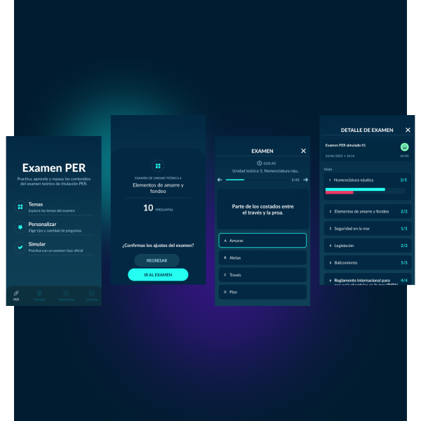
As a strategic UI designer, my focus would be on creating an useful user experience to help aspiring sailors prepare for their certification exam. To achieve this, I would prioritize intuitive navigation, simple and effective design, and engaging features that keep users motivated to practice. Here, I helped my client to deal with color palettes […]
Dice Game’s Interface
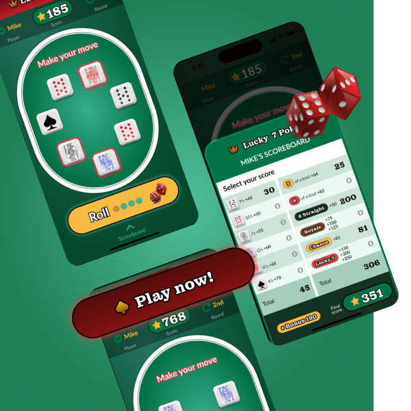
Overall, this app provides a modern twist on the classic game of Yahtzee, making it more engaging and fun. The app is user-friendly for all ages and skill levels, and its design preserves the essence of the game, while integrating it seamlessly into the digital world. To create a smooth and enjoyable user experience, I […]
Carsharing Solution
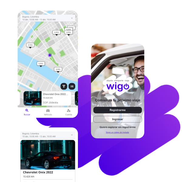
For this mobile car-sharing app we faced a challenge from the start, with the need to recycle existing code and resources while still delivering an innovative and user-friendly experience. So I strategically approached the project by first conducting a thorough analysis of our existing resources and identifying areas where they could be improved. Once we had […]
Optimizing delivery tasks
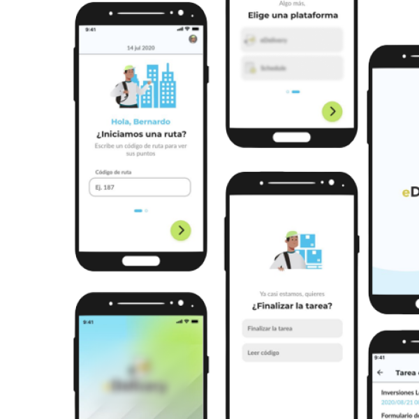
The redesigned delivery mobile app prioritizes ease of use, speed, and customization. Key features like real-time tracking, personalized notifications, and user-friendly navigation help streamline the delivery experience for carriers. One of the biggest challenges was creating a design that accommodated a wide range of delivery types, including food, groceries, retail items and also services. To […]